set.seed(123)
number_persons <- 10
y_binary <- rbinom(number_persons, size = 1, prob = 0.8)Binomial data (L9)
Introduction
In the previous chapter we moved from linear models and normal errors to generalized linear models (GLMs) to handle count responses with a Poisson GLM. In this chapter we move to another common case: binary and binomial responses. Because binary data is a special case of binomial data, we will often refer to both as “binomial data”.
At the heart of binomial data is an event that happens or does not happen. Examples include:
- Disease status: infected (1) or not infected (0)
- Survival: dead (1) or alive (0)
- Presence/absence of a species at a site: present (1) or absent (0)
- Success/failure of a treatment: success (1) or failure (0)
The central question is therefore:
Which explanatory variables influence the probability of the event happening.
Overview
In this chapter we will cover:
- A review of Bernoulli and binomial distributions (the family).
- Probabilities, odds, log-odds, odds ratios (the link function).
- Two examples of binomial GLM.
- Interpreting coefficients (odds ratios and probabilities).
- Model assumptions, deviances, and (some) model checking.
- Overdispersion in aggregated binomial data and the quasibinomial fix.
- Practical complications for individual-level (non-aggregated) 0/1 data.
Binary and binomial data
When we model binary/binomial data, we are interested in the probability of an event happening. For example, the probability of a heart attack, or the probability of a species being present at a site. And we are interested in whether such probabilities differ between groups, or vary along a continuous explanatory variable.
Let us label this probability \(\pi\). So \(\pi\) is the probability of “yes” (e.g., pass a test), and \(1-\pi\) is the probability of “no” (e.g., fail a test).
So, if the probability \(\pi\) is 0.8, then there is an 80% chance of “yes” and a 20% chance of “no”. In R we can simulate the pass or fail of each of a group of people with an expected pass rate (probability) of 0.8 like this:
This code says please draw 10 random numbers from a binomial distribution where each number is the result of 1 trial (size = 1) with a probability of success of 0.8 (prob = 0.8). Because size = 1, each number will be either 0 or 1.
Hence, the object y contains 10 simulated persons, where each person has an 80% chance of being 1:
y_binary [1] 1 1 1 0 0 1 1 0 1 1What we have done is to simulate 10 Bernoulli trials with probability 0.8. A Bernoulli trial is one random experiment with exactly two possible outcomes, “success” (1) and “failure” (0), where the probability of success is \(\pi\).)
You can see that the observations in y are either 0 or 1: they are binary data.
An alternate method to simulate and express the same kind of data is binomial data, where we count the number of successes (1s) in a number of trials. In R, we simulate this like so:
set.seed(123)
number_persons <- 10
y_binomial <- rbinom(1, size = number_persons, prob = 0.8)
This code says please draw 1 random number from a binomial distribution where the number of trials is 10 (size = 10) with a probability of success of 0.8 (prob = 0.8). The result is the number of successes (1s) in those 10 trials, in this particular simulation it is:
y_binomial[1] 9We know to expect that 8 of the 10 persons will be 1 (success), because the probability of success \(\pi = 0.8\). But the actual number of successes in any one simulation can vary due to chance. In the binary data example above we by chance got
sum(y_binary)[1] 7successes (1s) out of 10 persons. In the binomial data example above we got:
y_binomial[1] 9So in neither case did we get exactly 8 successes! What is the chance of that!
Well, we can calculate the probability of getting exactly \(k\) successes in \(n\) trials with success probability \(\pi\) using the binomial probability formula:
\(P(Y=k) = \binom{n}{k} \pi^k (1-\pi)^{n-k}\)
where \(\binom{n}{k} = \frac{n!}{k!(n-k)!}\) is the binomial coefficient, which counts the number of ways to choose \(k\) successes from \(n\) trials.
In R, we can calculate the probability of getting exactly 8 successes in 10 trials with success probability 0.8 as:
dbinom(8, size = 10, prob = 0.8)[1] 0.3019899And we can make a graph of the full probability distribution for getting \(k\) successes in 10 trials with success probability 0.8:
p_k_successes <- dbinom(0:10, size = 10, prob = 0.8)
ggplot(mapping = aes(x = 0:10, y = p_k_successes)) +
  geom_point() +
  geom_line(col="lightgrey") +
  scale_x_continuous(breaks = seq(0, 10, by = 1)) +
  labs(x = "Number of successes", y = "Probability")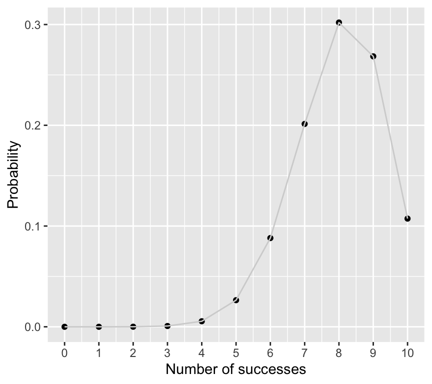
So the probability of getting exactly 8 successes is actually quite low, at about 0.3. But it is still the most likely outcome.
Important
So what??? You should now understand two important things:
- The relationship between binary data (0/1) and binomial data (counts of successes out of trials).
- That the binomial distribution is appropriate for modelling both binary and binomial data. Hint: in a GLM, we will therefore use the
binomialfamily.
Probabilities, odds, log-odds, and odds ratios
Odds
OK, so we know that when we analyse binary/binomial data, we are interested in the probability of an event happening, denoted by \(\pi\).
A related quantity is the odds of the event happening. The odds is defined as the ratio of the probability of the event happening to the probability of it not happening:
- Odds is \(\pi/(1-\pi)\)
We sometimes say “the odds of an event happening are x to y”. For example, a horse has 4 to 1 odds of winning a race. This means that in 5 races we expect the horse to win 4 times and lose once. The odds are \(4/1 = 4\). The probability of winning is then \(4/(4+1) = 0.8\).
If the horse was really bad and had 1 to 4 odds of winning, then the odds of winning would be 0.2/0.8 = 0.25, and the probability of winning would be 0.2.
So, odds and probabilities are related mathematically, but they are not the same thing. Lets look at a graph of probability on the \(x\)-axis and odds on the \(y\)-axis:
prob_seq <- seq(0.01, 0.99, by = 0.01)
odds_seq <- prob_seq / (1 - prob_seq)
ggplot(mapping = aes(x = prob_seq, y = odds_seq)) +
  geom_line() +
labs(x = "Probability", y = "Odds") 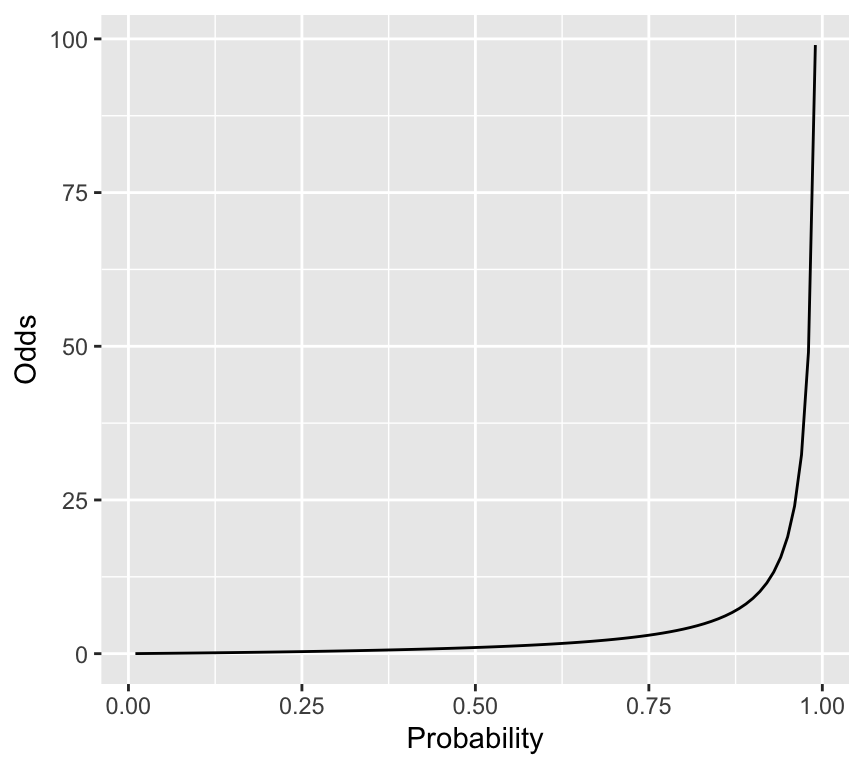
So, when we transform probabilities to odds, we go from a bounded scale (0 to 1) to an unbounded scale (0 to infinity).
Log-odds (logit)
Another useful transformation is the log-odds, also known as the logit:
- Log-odds (logit) is \(\log\left(\frac{\pi}{1-\pi}\right)\)
Here is the relationship between probability and log-odds:
log_odds_seq <- log(odds_seq)
ggplot(mapping = aes(x = prob_seq, y = log_odds_seq)) +
  geom_line() +
  labs(x = "Probability", y = "Log-odds (logit)")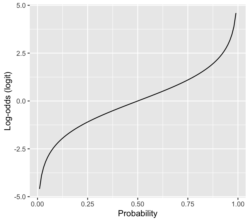
Important
So what???
The reason why the logit is useful is that it maps probabilities (0 to 1) to the whole real line (-infinity to infinity). This is important because in a GLM, the linear predictor can take any value from -infinity to infinity, so we need a link function that can map between the two scales. The logit does this perfectly.
Odds ratio
Finally, we often want to compare the odds of an event happening in two different groups. Say we have two groups, group 1 and group 2, with probabilities \(\pi_1\) and \(\pi_2\). The odds in each group are:
- Odds in group 1: \(\frac{\pi_1}{1-\pi_1}\)
- Odds in group 2: \(\frac{\pi_2}{1-\pi_2}\)
The odds ratio (OR) compares the odds in two groups:
Odds Ratio = OR = \(\frac{\text{odds in group 1}}{\text{odds in group 2}}\).
Let’s go through a couple of examples. First, suppose the probability of success is 0.2 in both groups. Then the odds in both groups are:
- Odds in group 1 and 2: \(\frac{0.2}{1-0.2} = \frac{0.2}{0.8} = 0.25\)
So the odds ratio is:
\(OR = \frac{0.25}{0.25} = 1\)
Now take an example where the probability of success in group 1 is 0.4, and in group 2 it is 0.2. Then the odds in each group are:
- Odds in group 1: \(\frac{0.4}{1-0.4} = \frac{0.4}{0.6} = 0.667\)
- Odds in group 2: \(\frac{0.2}{1-0.2} = \frac{0.2}{0.8} = 0.250\)
So the odds ratio is:
\(OR = \frac{0.667}{0.250} = 2.67\)
This means that the odds of success in group 1 are about 2.67 times the odds of success in group 2.
Important
So what???
You will see below that the coefficients in a binomial GLM with logit link correspond to log-odds ratios. Exponentiating those coefficients gives odds ratios. This is a key part of interpreting the results of a binomial GLM.
For example, when we see a coefficient (e.g., slope) close to zero, that means the log-odds ratio is close to zero, which means the odds ratio is close to 1, which means there is little difference in odds between the two groups.
A simple binomial GLM
We now have the pieces to define a binomial GLM:
- Family: \(y_i \sim \text{Binomial}(n_i,\pi_i)\)
- Linear predictor: \(\eta_i = \beta_0 + \beta_1 x_i^{(1)} + \cdots + \beta_p x_i^{(p)}\)
- Link: logit link: \(\eta_i = \log\left(\frac{\pi_i}{1-\pi_i}\right)\)
Let us make a simple example in which there we are interested in how the probability of passing a test differs between children and adults. We will simulate the data, and then fit a binomial GLM.
To simulate that data we will define the number of children and adults, and the probability of passing the test in each group:
set.seed(8761)
n_children <- 50
n_adults <- 50
p_pass_children <- 0.8
p_pass_adults <- 0.4
Now let us simulate whether each person passes or fails, using the rbinom() function:
y_children <- rbinom(n_children, size = 1, prob = p_pass_children)
y_adults <- rbinom(n_adults, size = 1, prob = p_pass_adults)
Now we can combine the data into a data frame (tibble), and look at the data:
data_binom <- tibble(
  age_group = rep(c("child", "adult"), each = 50),
  pass = c(y_children, y_adults)
)
data_binom
# A tibble: 100 × 2
age_group pass
<chr> <int>
1 child 1
2 child 0
3 child 1
4 child 1
5 child 1
6 child 1
7 child 0
8 child 1
9 child 1
10 child 1
# ℹ 90 more rowsWe can summarize the data to see how many passed in each group:
data_summary <- data_binom |>
  group_by(age_group) |>
  summarise(
    n_tested = n(),
    n_passed = sum(pass),
    pass_rate = mean(pass)
  )
data_summary
# A tibble: 2 × 4
age_group n_tested n_passed pass_rate
<chr> <int> <int> <dbl>
1 adult 50 30 0.6
2 child 50 39 0.78In the simulated experiment, 78% of the children passed, when the true probability of passing was 0.8. The adults did really well! – 60% of the adults passed, when the true probability was 0.4.
If we had collected that data for real, we might be interested in if the difference in pass rates between children and adults is statistically significant. We can use a binomial GLM to test that. Here is how we specify and fit the model in R:
binom_glm <- glm(pass ~ age_group, data = data_binom, family = binomial(link = "logit"))The critical part here is the family = binomial(link = "logit") argument, which tells R to fit a binomial GLM with a logit link function. Note that if we do not specify the link function, R will use the logit link by default for the binomial family. This means that the following model specification is equivalent:
binom_glm <- glm(pass ~ age_group, data = data_binom, family = binomial)We can look at the estimated coefficients to see the result:
coef(summary(binom_glm)) Estimate Std. Error z value Pr(>|z|)
(Intercept) 0.4054651 0.2886751 1.404572 0.16014849
age_groupchild 0.8602013 0.4470831 1.924030 0.05435084Important: The estimates are on the scale of the linear predictor, which is the logit (log-odds) scale. The intercept corresponds to the log-odds of passing for the reference group (adults), and the coefficient for age_groupchild corresponds to the difference in log-odds between adults and children.
So the logit (log-odds) for adults to pass is 0.405. To convert that to a probability, we can use the inverse logit function:
\(\pi = \frac{\exp(\eta)}{1+\exp(\eta)}\)
Calculating that in R:
eta_adults <- coef(binom_glm)[["(Intercept)"]]
p_adults <- exp(eta_adults) / (1 + exp(eta_adults))
p_adults
[1] 0.6Perfect. It is as we saw when we summarised the data – this is the observed pass rate for adults.
To find the probability of passing for children, we calculate the logit value for children by adding the coefficient for age_groupchild to the intercept:
Logit for children = 0.405 + 0.860 = 1.265
Then we convert that to a probability:
eta_children <- eta_adults + coef(binom_glm)[["age_groupchild"]]
p_children <- exp(eta_children) / (1 + exp(eta_children))
p_children
[1] 0.78Perfect again.
The odds ratio
It is useful to know about and use something called the odds ratio. The odds ratio compares the odds of an event happening in two situations. In our example, we can calculate the odds ratio for passing the test for children compared to adults.
Let’s use the logit values we calculated above, which we have to exponentiate to transform back to odds:
- Odds for adults: exp(0.405)
- Odds for children: exp(1.265)
The odds ratio (OR) for children compared to adults is:
\[\exp(1.265) / \exp(0.405) = \exp(1.265 - 0.405) = \exp(0.860) = 2.363\]
In the line above, notice the \(\exp(0.860)\) term. The number 0.860 is exactly the coefficient for age_groupchild in the model output. So we can get the odds ratio directly from the model coefficients by exponentiating the coefficient for age_groupchild. Put another way, the coefficient for age_groupchild is the log-odds ratio for children compared to adults.
This isn’t magic. Its just a straightforward consequence of how the logit link function works. In the following example of binomial regression, you will see how with a continuous explanatory variable, the coefficient (slope) corresponds to the change in log-odds for a one-unit increase in the explanatory variable, and exponentiating that coefficient gives the odds ratio for a one-unit increase.
Naming models (logistic regression)
Logistic regression is a very important term. It is a binomial GLM with logit link. I.e., it is what we have just described above!
The reason it (a binomial GLM with logit link) is called logistic regression is that the inverse of the logit function is called the logistic function. So logistic regression is just a special case of binomial GLM. The logistic function looks like a “squashed” S-shaped curve that maps the whole real line to the interval (0, 1). This is perfect for modelling probabilities.
Beetle mortality and insecticide dose (aggregated data)
Let’s work though an example of binomial regression, with data in what we call aggregated format. This simply means that we have counts of successes and failures for groups of individuals, rather than individual-level 0/1 data.
Eight groups of beetles were exposed to an insecticide dose for 5 hours. For each dose level, we know how many beetles were tested and how many died. This is binomial (aggregated) data.
Read in the beetle dataset:
beetle <- read_csv("datasets/beetle_mortality.csv")Rows: 8 Columns: 4
── Column specification ────────────────────────────────────────────────────────
Delimiter: ","
dbl (4): Dose, Number_tested, Number_killed, Mortality_rate
ℹ Use `spec()` to retrieve the full column specification for this data.
ℹ Specify the column types or set `show_col_types = FALSE` to quiet this message.Here are the first few rows of the beetle dataset:
head(beetle)# A tibble: 6 × 4
Dose Number_tested Number_killed Mortality_rate
<dbl> <dbl> <dbl> <dbl>
1 49.1 49 6 0.122
2 53.0 60 13 0.217
3 56.9 62 18 0.290
4 60.8 56 28 0.5
5 64.8 63 52 0.825
6 68.7 59 53 0.898It contains one explanatory variable (Dose) and two pieces of information about the binary response variable (Number_killed and Number_tested). The mortality rate is also included, and is the proportion killed at each dose (Number_killed / Number_tested).
As always, start with a graph.
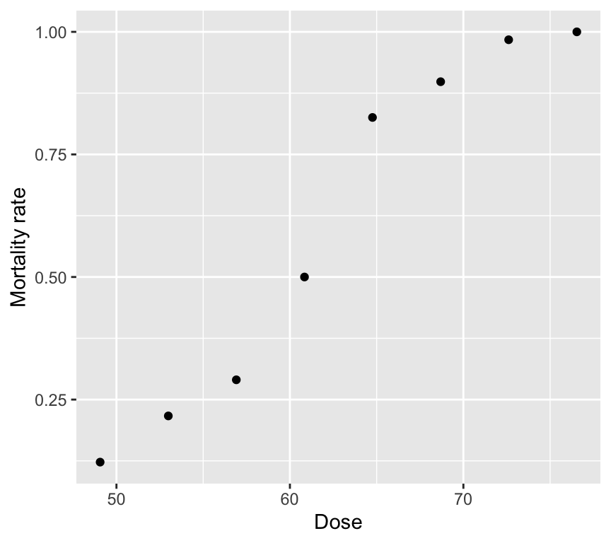
Two tempting but wrong analyses
Wrong analysis 1: linear regression on mortality rate
mod_beetle_lm <- lm(Mortality_rate ~ Dose, data = beetle)This can predict probabilities below 0 or above 1 and does not respect the mean–variance structure of binomial data.
Check out the model assumptions:
par(mfrow = c(2, 2))
plot(mod_beetle_lm)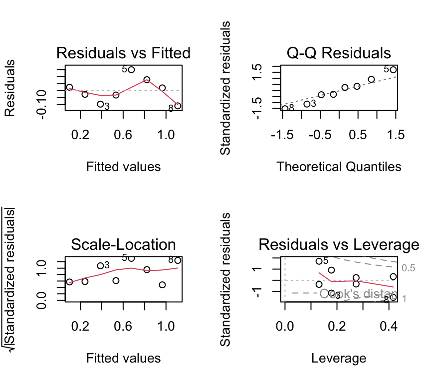
We don’t have so many data points here, but the residuals vs fitted indicating non-linearity and the Q-Q plot indicating non-normality are both concerning. Also the scale-location plot suggests non-constant variance.
Wrong analysis 2: Poisson regression on counts killed
A Poisson model ignores the fact that deaths are bounded by the number tested at each dose.
mod_beetle_pois <- glm(Number_killed ~ Dose, data = beetle, family = poisson)
summary(mod_beetle_pois)$coefficients
Estimate Std. Error z value Pr(>|z|)
(Intercept) -0.77418056 0.494639994 -1.565139 1.175502e-01
Dose 0.06678281 0.007240113 9.224002 2.862145e-20One issue that can now happen is that we can get “impossible” predictions: predicted counts killed that exceed the number tested.
# Example of the "impossible" issue:
dose_example <- 76.54
pred_killed <- predict(mod_beetle_pois,
                       newdata = data.frame(Dose = dose_example),
                       type = "response")
pred_killed
1
76.50652 num_tested_example <- beetle$Number_tested[beetle$Dose == dose_example]
num_tested_example[1] 60At the highest dose (76.54), the model predicts about 76 deaths, but only 60 beetles were tested! Clearly this is an impossible prediction. We can’t go on with the Poisson model either.
Caution
Poisson vs binomial, when to use each
Use a Poisson model when counts have no known upper limit.
Use a binomial model when counts are “\(k\) successes out of \(n\) trials”. Use a binomial/binary model when each observation is a 0/1 response.
Doing it right!
For aggregated binomial data, we provide successes and failures:
beetle <- beetle |>
  mutate(Number_survived = Number_tested - Number_killed)
head(beetle)
# A tibble: 6 × 5
Dose Number_tested Number_killed Mortality_rate Number_survived
<dbl> <dbl> <dbl> <dbl> <dbl>
1 49.1 49 6 0.122 43
2 53.0 60 13 0.217 47
3 56.9 62 18 0.290 44
4 60.8 56 28 0.5 28
5 64.8 63 52 0.825 11
6 68.7 59 53 0.898 6Now we can fit the logistic regression model, being careful to specify family = binomial and to use cbind(successes, failures) for the response. Because we specify the response this way, R knows we are working with aggregated binomial data. And because we specify family = binomial, R knows to use the logit link (the default).
beetle_glm <- glm(cbind(Number_killed, Number_survived) ~ Dose,
                  data = beetle, family = binomial)
And as usual we can check the model assumptions:
par(mfrow = c(2, 2))
plot(beetle_glm)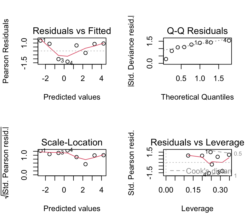
Not great, but again we have only 8 dose levels. Let us continue in any case and look at the ANOVA table and the coefficients.
Important
The response in aggregated binomial data
Use cbind(successes, failures) in glm(..., family = binomial).
- successes: number of 1s
- failures: number of 0s
Analysis of deviance (likelihood-based ANOVA)
As for count-data GLMs, the estimation of the coefficients is by maximum likelihood estimation (MLE). The measure of goodness-of-fit is the deviance. We can use an analysis of deviance table to see how much deviance is explained by dose.
anova(beetle_glm, test = "Chisq")Analysis of Deviance Table
Model: binomial, link: logit
Response: cbind(Number_killed, Number_survived)
Terms added sequentially (first to last)
Df Deviance Resid. Df Resid. Dev Pr(>Chi)
NULL 7 267.662
Dose 1 259.23 6 8.438 < 2.2e-16 ***
---
Signif. codes: 0 '***' 0.001 '**' 0.01 '*' 0.05 '.' 0.1 ' ' 1We see a table quite similar to that for the Poisson GLM. In this case the Dose row shows a huge amount of the deviance (259.23 units) is explained by dose, and so the \(p\)-value is very small.
Recall that we already used a chi-squared test for the Poisson GLM. We do the same here for the binomial GLM, because we are working with models estimated by maximum likelihood. So just as with the Poisson GLM, we use a chi-squared test here because, under certain regularity conditions, the change in deviance between nested models follows a chi-squared distribution with degrees of freedom equal to the difference in the number of parameters. If you are interested in what this means, you can read more about it in more advanced statistics textbooks mentioned in the Further reading section at the end of this chapter.
Plotting the fitted relationship
We will plot \(P(Y=1)\) (mortality probability) against dose using model predictions.
dose_grid <- tibble(Dose = seq(min(beetle$Dose)-20, max(beetle$Dose)+20, length.out = 400))
preds <- predict(beetle_glm, newdata = dose_grid, se.fit = TRUE) |>
  as_tibble() |>
         mutate(p_hat = exp(fit) / (1 + exp(fit)),
         p_hat_upper_2se = exp(fit + 2*se.fit) / (1 + exp(fit + 2*se.fit)),
         p_hat_lower_2se = exp(fit - 2*se.fit) / (1 + exp(fit - 2*se.fit))
       )
dose_grid <- bind_cols(dose_grid, preds)
And now the plot:
ggplot() +
  geom_point(data = beetle, aes(x = Dose, y = Mortality_rate)) +
  geom_line(data = dose_grid, aes(x = Dose, y = p_hat), color = "blue") +
  geom_ribbon(data = dose_grid,
              aes(x = Dose, ymin = p_hat_lower_2se, ymax = p_hat_upper_2se),
              alpha = 0.2, fill = "blue") +
  labs(x = "Dose", y = "Predicted mortality probability")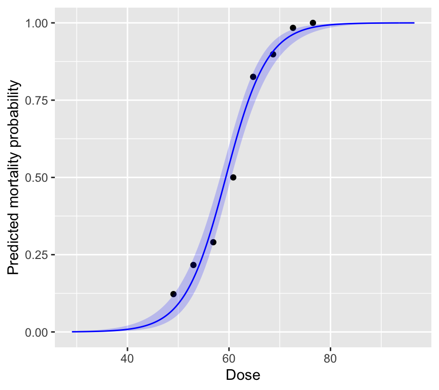
The plot is intentionally made to show what happens at very low and very high dose. At very low dose, the predicted mortality probability approaches 0, and at very high dose it approaches 1. This is a key feature of binomial regression: the predicted probabilities are always between 0 and 1. No matter the value of the linear predictor, the inverse logit transformation always maps it to a probability between 0 and 1.
We also see that the standard errors are larger at intermediate doses, where the slope of the curve is steepest. And the standard errors are smaller at very low and very high doses, where the curve flattens out.
Reporting
When reporting results from a logistic regression, you might say something like:
“A logistic regression was used to model the probability of beetle mortality as a function of insecticide dose. The odds of mortality increased by a factor of 1.28 (95% CI: 1.23, 1.34 per unit increase in dose. This indicates that higher doses are associated with higher odds of mortality. The model predicts that at a dose of 50, the probability of mortality is approximately 0.09 (95% CI: -2.34, -2.26 transformed to probability scale). The model explained a significant amount of deviance (Deviance = 8.4, df = 6, \(\chi^2\) p < 0.001).”
Overdispersion in aggregated binomial data
Overdispersion means the variability is larger than the binomial model assumes. A quick (rough) check for aggregated binomial data is:
\(\text{Residual deviance} \approx \text{df}\)
Values much larger than 1 for the ratio \(\frac{\text{Residual deviance}}{\text{df}}\) suggest overdispersion. In practice we look for values above about 1.5 or 2.
In the beetle mortality example:
deviance(beetle_glm)[1] 8.437898df.residual(beetle_glm)[1] 6deviance(beetle_glm) / df.residual(beetle_glm)[1] 1.406316The ratio is about 1.4, which is suggests some overdispersion, but is on the limit of what is usually considered acceptable.
Caution
Type I error inflation (binomial overdispersion)
If there is overdispersion and we ignore it, standard errors are usually too small and \(p\)-values can be too small (anti-conservative). That increases false positives (Type I errors).
Quasibinomial as a pragmatic fix
If we had found overdispersion, a simple fix is to use the quasibinomial family. This estimates an extra dispersion parameter from the data. For example:
beetle_glm_q <- glm(cbind(Number_killed, Number_survived) ~ Dose,
                    data = beetle, family = quasibinomial)
Note
quasibinomial estimates an extra dispersion parameter from the data. It is often a good “first fix” when aggregated binomial data look overdispersed.
Individual-level binary data (non-aggregated)
In some datasets we record a single 0/1 observation per individual, rather than aggregated counts for many individuals. The same logistic regression model is used, but:
- simple plots of \(y\) against explanatory variables look uninformative (two bands)
- some assumption and dispersion checks need extra care
Example: blood screening (ESR)
Individuals with low ESR (ESR is erythrocyte sedimentation rate and is a measure of general inflammation and infection) are generally considered healthy; ESR > 20 mm/hr indicates possible disease. We will model the probability of high ESR using fibrinogen and globulin concentration.
Read in the plasma dataset:
plasma <- read_csv("datasets/plasma_esr_original_HSAUR3.csv")Rows: 32 Columns: 4
── Column specification ────────────────────────────────────────────────────────
Delimiter: ","
chr (1): ESR
dbl (3): fibrinogen, globulin, y
ℹ Use `spec()` to retrieve the full column specification for this data.
ℹ Specify the column types or set `show_col_types = FALSE` to quiet this message.Here are the first few rows of the data:
plasma# A tibble: 32 × 4
fibrinogen globulin ESR y
<dbl> <dbl> <chr> <dbl>
1 2.52 38 ESR < 20 0
2 2.56 31 ESR < 20 0
3 2.19 33 ESR < 20 0
4 2.18 31 ESR < 20 0
5 3.41 37 ESR < 20 0
6 2.46 36 ESR < 20 0
7 3.22 38 ESR < 20 0
8 2.21 37 ESR < 20 0
9 3.15 39 ESR < 20 0
10 2.6 41 ESR < 20 0
# ℹ 22 more rowsThe ESR response variable is in two variables. ESR is a factor with levels “low” and “high”. It is also present as a numeric variable y, coded 0 (low) and 1 (high). The explanatory variables are fibrinogen and globulin, both continuous.
Complication 1: graphical description
Simple scatter plots of 0/1 data are not so informative:
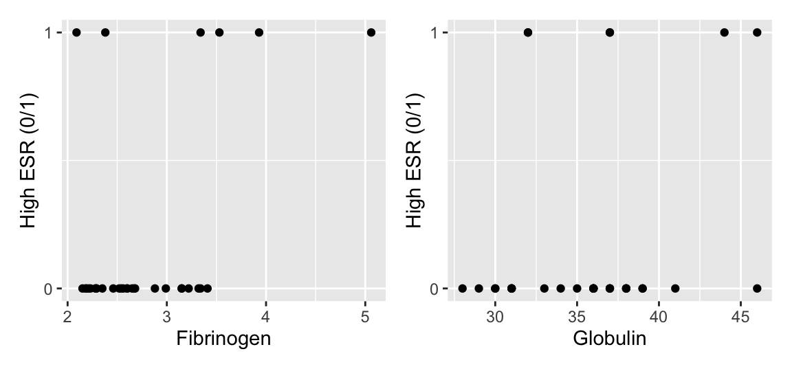
A more informative plot is a conditional density plot. This shows the proportion of 0s and 1s at each value of the explanatory variable.
par(mfrow = c(1, 2))
cdplot(factor(y) ~ fibrinogen, data = plasma, xlab = "Fibrinogen")
cdplot(factor(y) ~ globulin, data = plasma, xlab = "Globulin")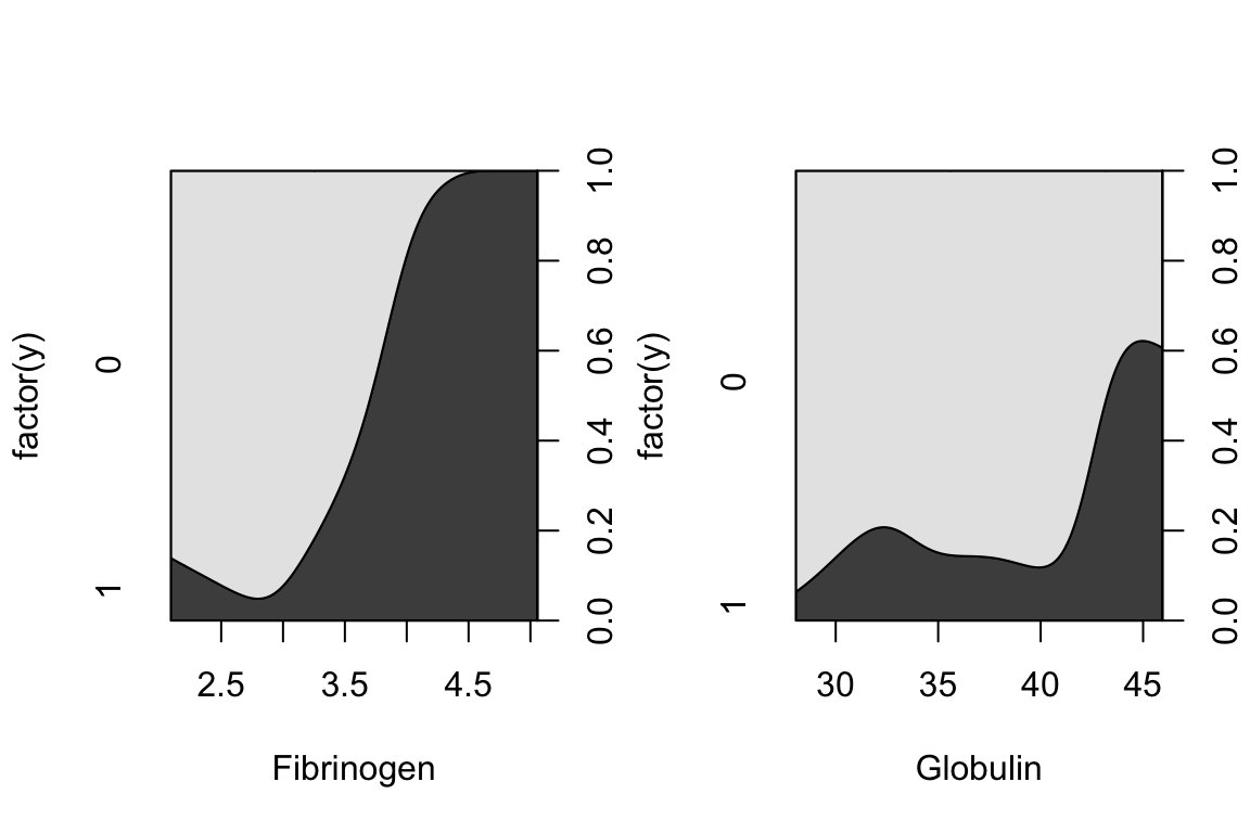
par(mfrow = c(1, 1))It looks like higher fibrinogen and higher globulin are associated with higher probability of high ESR. The pattern appears stronger for fibrinogen.
Fit the binomial regression model
In the case of non-aggregated individual-level 0/1 data, we simply use y as the response variable. We have to remember to specify family = binomial in glm().
plasma_glm <- glm(y ~ fibrinogen + globulin, data = plasma, family = binomial)Complication 2: model checking and dispersion
Residual plots exist, but can be hard to interpret for 0/1 data:
par(mfrow = c(2, 2))
plot(plasma_glm)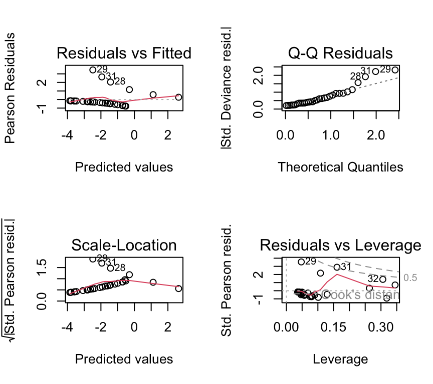
Important
Dispersion checks need caution for individual 0/1 data
The simple “residual deviance \(\approx\) residual df” rule-of-thumb is most useful for aggregated binomial data. With individual-level 0/1 data, detecting overdispersion is more subtle and often requires additional structure (e.g. grouping, random effects).
Two common practical issues
1. Separation
Sometimes a explanatory variable (or combination of explanatory variables) perfectly predicts the response variable (all 0s on one side, all 1s on the other). This is called (complete) separation and can cause extremely large coefficient estimates and warnings.
Caution
Separation warning
If your logistic regression produces enormous standard errors or warnings about fitted probabilities being 0 or 1, check for separation. Remedies include more data, simpler models, or penalized methods (advanced topic).
2. Probability vs odds ratio in reporting
Log odds ratios are the default “native” scale of the coefficients logistic regression, but probabilities are often easier to interpret. In practice, you may report odds ratios and translate to probabilities at meaningful explanatory variable values.
Multiple explanatory variables
Just as with linear models, and with Poisson GLMs, we can include multiple explanatory variables in a binomial GLM. The interpretation of coefficients is similar to that in linear models, but on the log-odds scale. We don’t always have well recognised names, like we do with linear models (e.g., ANCOVA, multiple regression). But the principles are the same.
Because we don’t have well recognised names for different types of binomial GLM with multiple explanatory variables, we just call them “binomial GLMs” or “logistic regression models”, and then describe the explanatory variables included. For example:
- A logistic regression model with one continuous and one categorical explanatory variable.
- A logistic regression model with two continuous explanatory variables and their interaction.
- A logistic regression model with three categorical explanatory variables and all possible interactions (a full factorial model, analogous to a three-way ANOVA).
Review
There is a lot more to logistic regression and binary data. We can of course make models to analyse more complex data and questions, including multiple explanatory variables, different types of explanatory variable (continuous and categorical), interactions, and so on. But the key ideas are all above. To summarize the main points:
- Data can be either aggregated binomial (successes out of trials) or individual-level 0/1.
- The key questions are about how explanatory variables influence the probability of “yes”.
- The distribution family is binomial (Bernoulli for individual-level data).
- The link function is the logit (log-odds).
- If we find overdispersion in aggregated binomial data,
quasibinomialis a pragmatic fix. - With non-aggregated individual-level 0/1 data, plotting and checking model assumptions require more care.
Further reading
- Chapter 17 of The R Book by Crawley (2012) provides a comprehensive introduction to GLMs in R, including binomial regression. The R is a bit old fashioned but the concepts are well explained.
- Generalized Linear Models With Examples in R (2018) by Peter K. Dunn and Gordon K. Smyth.