Review: planning and implementing statistical analyses (L12)
NoteLearning objectives
After this unit, students will be able to:
Write a planning sentence for a described study, stating the question, the type of response variable, the data structure, the explanatory variables, the planned model and the expected residual degrees of freedom.
Choose a model (linear model, binomial GLM, Poisson GLM, mixed model or ordination) from the type of response variable, the explanatory variables and the data structure of a described study.
Identify the experimental unit in a described study, and recognise pseudoreplication.
Explain the roles of replication, randomisation, controls, blocking and balance in study design.
Count the parameters a planned model will estimate, calculate the expected residual degrees of freedom, and judge whether they are enough.
Explain how sample size affects the precision of estimates and the power of a study, and what a power analysis is for.
Decide which terms to include in a model from the question and the design (variables of interest, planned interactions, design variables, potential confounders), and explain why trying many models or using stepwise selection gives misleading p-values.
Check a fitted model before interpreting it, make explicit predictions from it, and plot the predictions together with the data.
Recognise a report that gives both the statistical result and its biological meaning.
These learning objectives, together with the content of this chapter, define what you need to know for the exam.
This R script contains the code of this chapter, with comments that explain each step. Download it, save it in your BIO144 RStudio project folder, open it in RStudio, and run it line by line while you read the chapter or watch the video. The script reads the datasets directly from the internet. Its last section (“Practical toolbox”) shows code that the Unit 12 practical uses but this chapter does not.
To download the script straight into your project folder (for example on RStudio Server), run this line in the Console:
In earlier chapters we learned many different statistical tools:
linear regression
ANOVA
multiple regression
interactions
Poisson GLMs for count data
binomial GLMs for binary data
ordination
mixed models
This final chapter pulls those ideas together. The aim is not to memorize a list of tests. The aim is to move carefully from a biological question to a planned model, and then from a fitted model to a checked, interpreted, plotted, and reported result.
Important
Core idea
Do not start with “Which test do I use?” Start with the biological question, sketch the expected figure, identify the response variable and data structure, then choose the model.
The chapter has two parts:
Planning: what to decide before collecting or analyzing data.
Implementation: what to do once the data exist.
Part 1: Planning the analysis
Statistics does not begin after data collection. In a good study, the statistical plan is part of the study design.
Before collecting data, we should already be able to say:
Here is my biological question.
Here is the figure I expect to make.
Here is the response variable.
Here is the model I plan to fit.
Here is roughly how many observations I need, and how many residual degrees of freedom I expect.
This does not mean the plan can never change. Real data can surprise us. But without a plan, we often discover too late that the design does not answer the question.
The planning workflow
Biological question
        |
        v
Sketch expected figure
        |
        v
Define response variable
        |
        +-- Continuous -> LM / Gaussian model
        +-- Binary / proportion -> binomial GLM
        +-- Count -> Poisson/count GLM
        +-- Multivariate -> ordination / multivariate methods
        |
        v
Check data structure
        |
        +-- independent observations -> ordinary LM / GLM
        +-- grouped / repeated / blocked / nested -> mixed model / random effects
        |
        v
Define explanatory variables
        |
        +-- categorical -> group differences
        +-- continuous -> slopes
        +-- categorical + continuous -> ANCOVA-style model
        +-- multiple predictors -> multiple model
        +-- interactions -> one effect depends on another
        |
        v
Planned statistical model
        |
        v
Plan sample size and expected residual df
Traditional names like ANOVA, regression, and ANCOVA are useful, but they are not the deepest decision. They are mostly different fixed-effect structures inside the linear model.
The deeper questions are:
What kind of response variable do I have?
Are the observations independent, or is there grouping/repeated structure?
What kind of explanatory variables do I have?
The planning sentence
A useful planning sentence is:
We will test whether X affects (or is related with) Y using model Z, because Y is [response type], X is [predictor type], and the observations are [independent/grouped]. We plan to collect n = … observations, giving n minus the number of estimated parameters residual degrees of freedom.
This sentence is not just a reporting sentence. It is a design sentence. If you cannot complete it, the study plan (including question) is probably not clear enough yet.
Note
Residual degrees of freedom are not magic numbers that appear later in R. They are already implied by the design and the model.
Example 1: Comparing treatment means
Biological question:
Does fertilizer treatment affect plant biomass?
Planning step
Decision
Expected figure
Biomass on the y-axis, fertilizer treatment on the x-axis; probably a boxplot, dot plot, or means with confidence intervals
Response variable
Plant biomass, continuous
Data structure
Each plant is measured once and plants are independent
Explanatory variables
Fertilizer treatment, categorical: control, low fertilizer, high fertilizer
Planned model
Gaussian linear model with biomass as the response and fertilizer treatment as the explanatory variable
Traditional name
One-way ANOVA, also understood as a linear model with one categorical predictor
Example model:
m_biomass_fertilizer <-lm(biomass ~ fertilizer, data = plants)
Suppose we plan 20 plants per treatment and 3 treatments. That gives \(n = 60\) observations.
The model estimates 3 treatment means, so the expected residual df is approximately:
60 - 3 = 57
Planning sentence:
We will test whether fertilizer treatment affects plant biomass using a Gaussian linear model, because biomass is continuous, fertilizer treatment is categorical, and each plant is measured independently. We plan to collect 60 observations, 20 per treatment, giving an expected residual df of about 57.
Example 2: A continuous predictor
Biological question:
Does temperature affect growth rate?
Planning step
Decision
Expected figure
Growth rate on the y-axis, temperature on the x-axis; a scatterplot with a fitted line and uncertainty band
Response variable
Growth rate, continuous
Data structure
Each experimental unit is measured once and observations are independent
Explanatory variables
Temperature, continuous
Planned model
Gaussian linear model with a continuous predictor
Traditional name
Linear regression
Example model:
m_growth_temperature <-lm(growth_rate ~ temperature, data = growth)
Suppose we plan \(n = 50\) observations across the temperature gradient.
The model estimates an intercept and a slope, so the expected residual df is:
50 - 2 = 48
Planning sentence:
We will test whether temperature affects growth rate using a Gaussian linear model, because growth rate is continuous, temperature is continuous, and observations are independent. We plan to collect 50 observations, giving an expected residual df of about 48.
The expected figure helps clarify the model. If the figure is a scatterplot with one fitted line, the model is probably a regression-type model.
Example 3: Grouping structure and random effects
Biological question:
Does a drug treatment affect heart rate when each animal is measured repeatedly over time?
Planning step
Decision
Expected figure
Heart rate on the y-axis, time or treatment on the x-axis, with repeated measurements connected or grouped by animal
Response variable
Heart rate, continuous
Data structure
Observations are not independent, because each animal contributes multiple measurements
Explanatory variables
Treatment is categorical; time may be continuous or categorical, depending on the design
Planned model
Mixed model, because repeated measurements are grouped within animals
Random effect
Animal identity, because measurements are repeated within animal
Example model:
m_heart_rate <-lmer(heart_rate ~ treatment + time + (1| animal_id), data = heart)
If the biological question is whether the treatment changes the trajectory through time, then plan an interaction:
m_heart_rate_interaction <-lmer(heart_rate ~ treatment * time + (1| animal_id), data = heart)
Here we need to plan both the number of animals and the number of measurements per animal. For example, 20 animals measured 5 times each gives 100 observations, but those 100 observations are not equivalent to 100 independent animals.
Planning sentence:
We will test whether drug treatment affects heart rate over time using a mixed model, because heart rate is continuous, treatment and time are explanatory variables, and repeated measurements are grouped within animals. We plan to measure 20 animals 5 times each, giving 100 total observations, while accounting for animal identity as a random effect.
Caution
The random-effects question comes early. Before asking “ANOVA or regression?”, ask whether the observations are independent.
Example 4: Binary response
Biological question:
Does habitat type affect whether individuals are infected?
Planning step
Decision
Expected figure
Infection probability on the y-axis and habitat type on the x-axis, perhaps shown as proportions with confidence intervals
Response variable
Infection status: infected or not infected, binary
Data structure
Each individual is sampled once and observations are independent
Explanatory variables
Habitat type, categorical
Planned model
Binomial GLM
Example model:
m_infection_habitat <-glm(infected ~ habitat, family = binomial, data = infection)
Suppose we plan 50 individuals in each of two habitats, giving \(n = 100\) observations. With two habitat groups, the expected residual df is roughly:
100 - 2 = 98
Planning sentence:
We will test whether infection probability differs between habitats using a binomial GLM, because infection status is binary, habitat is categorical, and individuals are independent. We plan to sample 100 individuals, 50 per habitat, giving an expected residual df of about 98.
The explanatory variable could be categorical or continuous, just as in a linear model. What changes the model class is the response variable.
Designing the study so that it is easy to analyse
The planning sentence assumes that the data will be collected in a way that can answer the question. A few principles of study design make this much more likely. You have met each of them in earlier chapters; here they are together.
Identify the experimental unit. The experimental unit is the thing to which a treatment is independently applied (or, in an observational study, the independent thing we sample). It is the unit of replication. If fertiliser is applied to whole pots, and we measure five plants per pot, the pot is the experimental unit, not the plant.
Replicate. We need several independent experimental units per treatment (or across the range of a continuous explanatory variable). Replication is what lets us estimate the residual variance and so the uncertainty of our estimates.
Avoid pseudoreplication. Measuring the same unit several times, or measuring several subunits within a unit, does not give independent replicates. Either analyse the units (for example, using averages per unit), or model the grouping with a mixed model (Chapter 11). Treating subunits as independent overstates the residual degrees of freedom and gives over-confident results.
Randomise. Assign treatments to experimental units at random. Randomisation breaks any link between the treatment and other variables that might affect the response, which is why experiments give the strongest evidence for causal effects (Chapters 4 and 6).
Include controls. A comparison group (for example, no fertiliser) is needed to know what would have happened without the treatment.
Block when units differ in known ways. If experimental units differ in a known way (for example, different greenhouse benches, or different days), put a full set of treatments in each block, and include the block in the model, as a fixed or random effect. This removes the variation between blocks from the residual variation and makes treatment comparisons more precise.
Aim for balance. Equal numbers of units per treatment (or per combination of treatments) make the analysis simpler and more robust, and make the estimates as precise as possible for a given total effort.
In observational studies, plan for confounders. List the variables that might be associated with both the explanatory variable of interest and the response, and plan to measure them (Chapter 6).
How many observations? Sample size, precision and power
More observations give more precise estimates. The standard error of an estimate is roughly proportional to \(1/\sqrt{n}\), so to halve the width of a confidence interval we need about four times as many observations. More observations also give more residual degrees of freedom, and we saw in Chapter 3 why having few residual degrees of freedom is a problem: the residual variance is estimated imprecisely and the critical \(t\)-values are large.
A few practical guidelines:
Count the parameters the planned model will estimate (including the intercept, each slope, \(k-1\) parameters for each categorical variable with \(k\) levels, and the parameters for any interactions), and check that the planned number of observations leaves plenty of residual degrees of freedom. A common rough guide is to aim for at least 10–20 observations per estimated parameter.
Remember that the number that matters is the number of independent experimental units, not the number of measurements (see pseudoreplication above).
The power of a study is the probability that it detects an effect of a given size, if that effect really exists. Power increases with the number of observations and with the size of the effect, and decreases with the residual variation. A formal power analysis uses these quantities to calculate the sample size needed. We do not cover how to do a power analysis in this course (see Chapter 11.2), but you should know what it is and why it is done before collecting data.
Deciding which terms go into the model
The terms in the model should follow from the question and the design, and should be decided before looking at the results.
The explanatory variables of interest come from the question.
Interactions are included when the question is about whether one effect depends on another (Chapter 7), or when the design is fully crossed (factorial) and an interaction is biologically plausible.
Design variables are included because of how the data were collected: blocks, and grouping variables as random effects (Chapter 11). They are included whether or not they turn out to be “significant”.
Potential confounders (in observational studies) are included because of biological knowledge that they may affect both the response and the explanatory variables of interest (Chapter 6).
What to avoid:
Trying many models and reporting the one that gives the result you hoped for. Adding and removing terms, transformations or observations until a \(p\)-value becomes small is a form of “p-hacking” (Chapter 3). The \(p\)-values from the final model are then misleading, because they do not take into account all the models that were tried.
Automatic variable selection (such as stepwise selection, which adds or removes terms one by one according to their \(p\)-values). It suffers from the same problem.
In this course we test terms with \(F\)-tests (for linear models) and likelihood ratio (chi-squared) tests (for GLMs), comparing models that differ only in the terms relevant to the planned question. Other approaches to choosing among models, such as information criteria (e.g. AIC), are not covered in this course. If an analysis is exploratory, rather than planned, say so clearly when reporting it.
Part 2: Implementing the analysis
Once we have the data, the key implementation question is:
Did the model behave well enough that we can interpret it?
The workflow is:
Fit planned model
        |
        v
Check model assumptions / diagnostics
        |
        +-- okay -> interpret model output
        +-- not okay -> revise model / family / structure
        |
        v
Interpret output
        |
        v
Make explicit predictions
        |
        v
Plot data + model predictions
        |
        v
Report statistical and biological conclusion
Important
The order matters. We do not fit a model, look for a small p-value, and only then check whether the model was reasonable. We check first, then interpret.
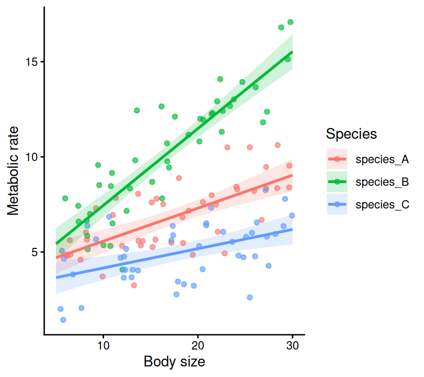
Good practice is to make predictions explicitly from the fitted model and then plot those predictions. The figure should show the model you fitted, not a model quietly fitted by the plotting function.
Example 1: Linear model with an interaction
Biological question:
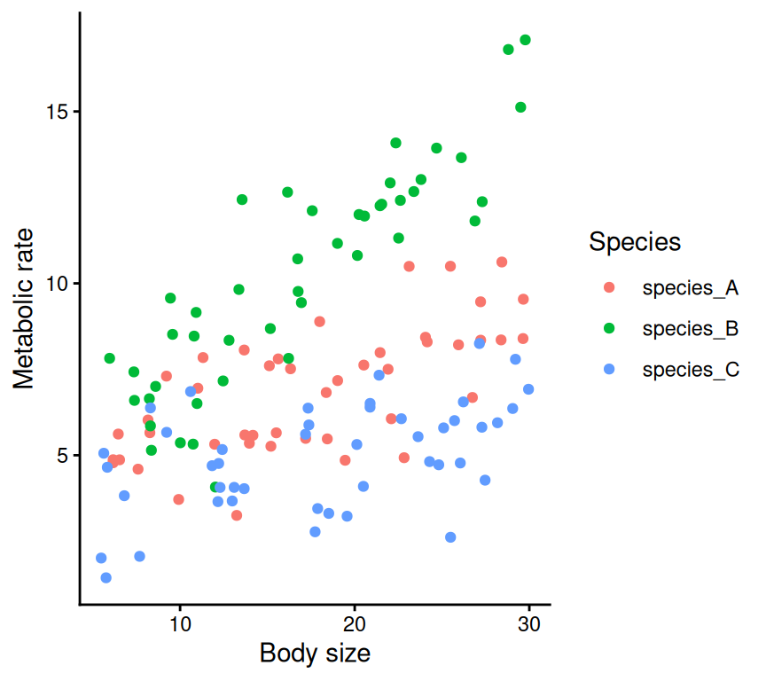
Does body size affect metabolic rate, and does this body-size effect differ among three species?
This example connects several ideas from the course:
regression
treatment groups
interactions
diagnostic plots
reading model output
degrees of freedom
explicit prediction and plotting
Planning recap
Planning step
Decision
Expected figure
Scatterplot of metabolic rate against body size, with separate fitted lines for each species
Response variable
metabolic_rate, continuous
Data structure
Independent observations, assuming each individual is measured once
Explanatory variables
body_size, continuous; species, categorical
Planned model
Gaussian linear model with a species-by-body-size interaction
Approximate residual df
Number of observations minus number of estimated parameters
Planning sentence:
We will test whether body size affects metabolic rate differently among species using a Gaussian linear model with a species-by-body-size interaction, because metabolic rate is continuous, body size is continuous, species is categorical, and observations are independent.
Rows: 135 Columns: 3
── Column specification ────────────────────────────────────────────────────────
Delimiter: ","
chr (1): species
dbl (2): body_size, metabolic_rate

ℹ Use `spec()` to retrieve the full column specification for this data.
ℹ Specify the column types or set `show_col_types = FALSE` to quiet this message.
m_metabolism <-lm(metabolic_rate ~ species * body_size, data = metabolism)
The model formula:
metabolic_rate ~ species * body_size
means:
metabolic_rate ~ species + body_size + species:body_size
The * means main effects plus the interaction. We use it when the biological question is whether the effect of one predictor depends on another predictor.
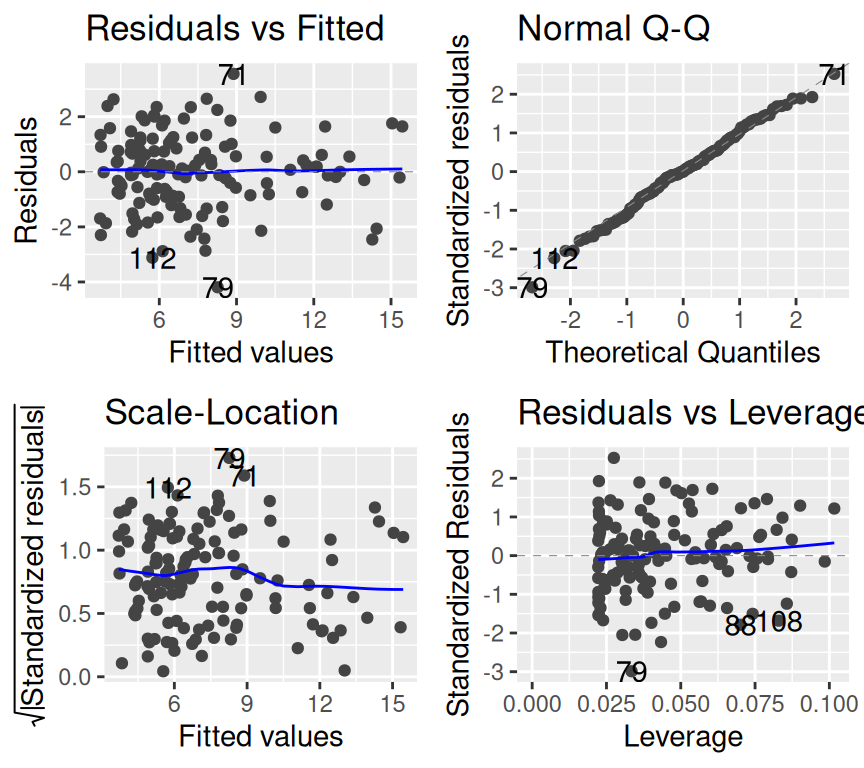
Check the model before interpreting
For a linear model, the common diagnostic questions are:
Diagnostic plot
Question
Residuals vs fitted
Is there obvious nonlinearity or unequal variance?
QQ plot
Are residuals approximately normal?
Scale-location
Does residual spread change with fitted values?
Residuals vs leverage
Are a few observations dominating the model?
autoplot(m_metabolism)
Warning: `fortify(<lm>)` was deprecated in ggplot2 4.0.0.
ℹ Please use `broom::augment(<lm>)` instead.
ℹ The deprecated feature was likely used in the ggfortify package.
  Please report the issue at <https://github.com/sinhrks/ggfortify/issues>.
Warning: Using `size` aesthetic for lines was deprecated in ggplot2 3.4.0.
ℹ Please use `linewidth` instead.
ℹ The deprecated feature was likely used in the ggfortify package.
  Please report the issue at <https://github.com/sinhrks/ggfortify/issues>.
We are not looking for perfect plots. We are looking for obvious problems that would make the model inappropriate.
Possible actions if diagnostics look bad:
reconsider whether the response should be transformed
reconsider whether the relationship is nonlinear
check for influential observations
check whether important grouping structure was ignored
for non-continuous responses, consider a GLM family instead of an LM
Interpret the output
summary(m_metabolism)
Call:
lm(formula = metabolic_rate ~ species * body_size, data = metabolism)

Residuals:
    Min      1Q  Median      3Q     Max
-4.1918 -0.8628 -0.0026  0.9103  3.5532

Coefficients:
                           Estimate Std. Error t value Pr(>|t|)
(Intercept)                 3.83601    0.56726   6.762 4.25e-10 ***
speciesspecies_B           -0.42823    0.80217  -0.534   0.5944
speciesspecies_C           -0.68723    0.79494  -0.865   0.3889
body_size                   0.17335    0.03001   5.777 5.40e-08 ***
speciesspecies_B:body_size  0.23073    0.04327   5.333 4.20e-07 ***
speciesspecies_C:body_size -0.07204    0.04127  -1.746   0.0832 .
---
Signif. codes:  0 '***' 0.001 '**' 0.01 '*' 0.05 '.' 0.1 ' ' 1

Residual standard error: 1.426 on 129 degrees of freedom
Multiple R-squared:  0.8028,    Adjusted R-squared:  0.7952
F-statistic:   105 on 5 and 129 DF,  p-value: < 2.2e-16
anova(m_metabolism)
Analysis of Variance Table

Response: metabolic_rate
                   Df Sum Sq Mean Sq F value    Pr(>F)
species             2 632.80  316.40 155.492 < 2.2e-16 ***
body_size           1 324.39  324.39 159.417 < 2.2e-16 ***
species:body_size   2 111.55   55.78  27.411 1.201e-10 ***
Residuals         129 262.50    2.03
---
Signif. codes:  0 '***' 0.001 '**' 0.01 '*' 0.05 '.' 0.1 ' ' 1
Use this table to orient yourself:
Question level
Model/output
Common test statistic
What it asks
Model / term level
ANOVA table for LM
F
Does this explanatory variable or term explain variation in the response?
Model / term level
Deviance comparison for GLM
Deviance / chi-square-like test
Does adding/removing this term improve the model?
Coefficient level
Linear model coefficients
t
Is this estimated coefficient different from zero?
Coefficient level
Binomial/Poisson GLM coefficients
z
Is this estimated coefficient different from zero on the link scale?
Coefficient level
Confidence interval
CI
What range of effect sizes is compatible with the data/model?
summary() often gives coefficient-level tests. anova() often gives term-level tests. These are related, but they are not always asking exactly the same question.
Residual degrees of freedom:
df.residual(m_metabolism)
[1] 129
Residual degrees of freedom are the amount of information left for estimating error after fitting the model. Here they are roughly the number of observations minus the number of estimated parameters.
nrow(metabolism)
[1] 135
length(coef(m_metabolism))
[1] 6
nrow(metabolism) -length(coef(m_metabolism))
[1] 129
Make explicit predictions
Do not use geom_smooth() as the model.
Instead:
fit the model
create new data containing the predictor values we want predictions for
The model and the figure now match. The lines and ribbons come from m_metabolism, the model we fitted and checked.
Report
Example structure:
We fitted a Gaussian linear model testing whether metabolic rate depended on body size, species, and their interaction. Diagnostic plots did not show major violations of model assumptions. Metabolic rate changed with body size, but the slope differed among species: the relationship was strongest in species B and weakest in species C. This indicates that species changed the relationship between body size and metabolism.
If giving formal results, add the relevant coefficient or term-level test from the output.
Example 2: Binomial GLM
Biological question:
Does habitat type affect whether individuals are infected?
Planning recap
Planning step
Decision
Expected figure
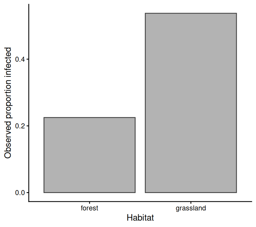
Infection probability or observed proportion infected by habitat
Response variable
infected, binary: 0 = not infected, 1 = infected
Data structure
Independent observations, assuming each individual is sampled once
Explanatory variables
habitat, categorical
Planned model
Binomial GLM
Approximate residual df
Number of observations minus number of estimated habitat probabilities
Planning sentence:
We will test whether infection probability differs between habitats using a binomial GLM, because infection status is binary, habitat is categorical, and observations are independent.
Rows: 160 Columns: 2
── Column specification ────────────────────────────────────────────────────────
Delimiter: ","
chr (1): habitat
dbl (1): infected

ℹ Use `spec()` to retrieve the full column specification for this data.
ℹ Specify the column types or set `show_col_types = FALSE` to quiet this message.
Is there overdispersion? (This question applies to counts and to grouped binomial data, i.e. successes out of a number of trials.)
The simple overdispersion check (residual deviance divided by residual degrees of freedom, roughly 1 if there is no overdispersion) is not useful here. Our response is individual-level 0/1 data (each row is one individual, infected or not). For such data the ratio says nothing about overdispersion, so we do not calculate it. (See the GLM checklist in Chapters 8 and 9.) We will use this check for the count data in the next example.
Interpret the output
summary(m_infection)
Call:
glm(formula = infected ~ habitat, family = binomial, data = infection)

Coefficients:
                 Estimate Std. Error z value Pr(>|z|)
(Intercept)       -1.2368     0.2677  -4.619 3.85e-06 ***
habitatgrassland   1.3870     0.3492   3.972 7.14e-05 ***
---
Signif. codes:  0 '***' 0.001 '**' 0.01 '*' 0.05 '.' 0.1 ' ' 1

(Dispersion parameter for binomial family taken to be 1)

    Null deviance: 212.70  on 159  degrees of freedom
Residual deviance: 195.76  on 158  degrees of freedom
AIC: 199.76

Number of Fisher Scoring iterations: 4
In a binomial GLM, coefficients are on the log-odds scale by default. That scale is useful for the model, but not always intuitive biologically.
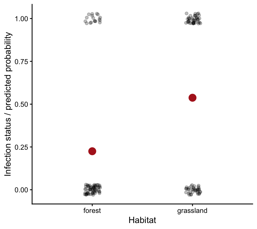
Predicted probabilities are often easier to interpret.
For GLMs, type = "response" gives predictions on the biological scale. For a binomial GLM, that means predicted probabilities.
Report
Example structure:
We fitted a binomial GLM testing whether infection probability differed between habitats. The model used infection status as a binary response and habitat as a categorical explanatory variable. After checking model fit, we interpreted the model on the probability scale: predicted infection probability was higher in grassland than forest.
Example 3: Count GLM
Biological question:
Does food availability affect the number of offspring produced?
Planning recap
Planning step
Decision
Expected figure
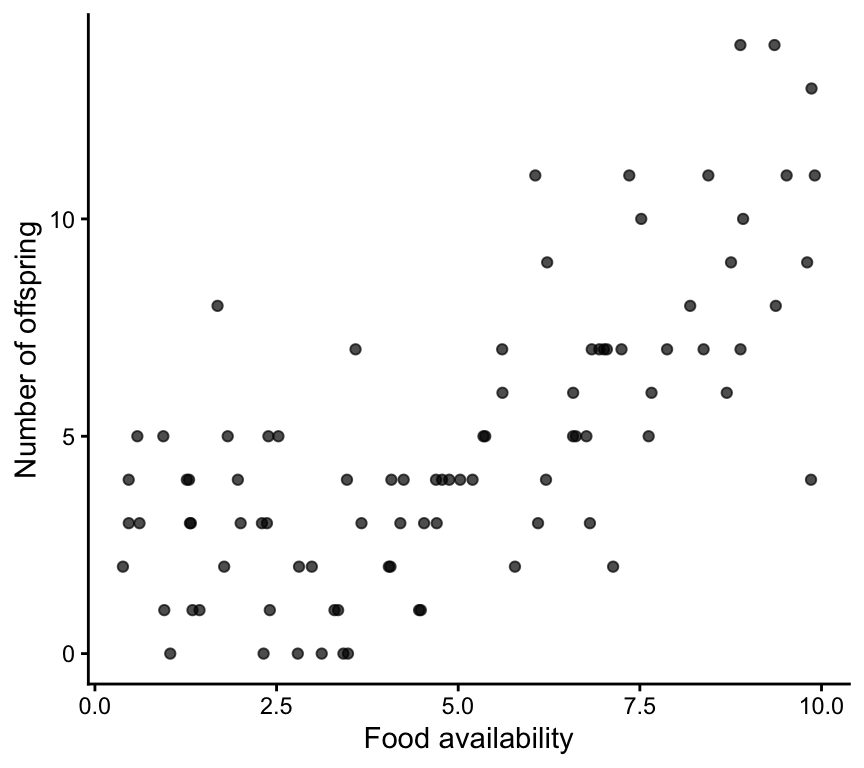
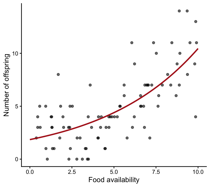
Scatterplot of offspring number against food availability, with a fitted prediction line
Response variable
n_offspring, count
Data structure
Independent observations, assuming each individual or reproductive unit is measured once
Explanatory variables
food, continuous
Planned model
Poisson GLM, with overdispersion checked after fitting
Approximate residual df
Number of observations minus number of estimated parameters
Planning sentence:
We will test whether food availability affects offspring number using a Poisson GLM, because offspring number is a count, food availability is continuous, and observations are independent.
Rows: 90 Columns: 2
── Column specification ────────────────────────────────────────────────────────
Delimiter: ","
dbl (2): food, n_offspring

ℹ Use `spec()` to retrieve the full column specification for this data.
ℹ Specify the column types or set `show_col_types = FALSE` to quiet this message.
For count models, overdispersion is a common issue. If the residual deviance is much larger than the residual df, the Poisson model may be too simple.
Here the ratio is 1.34. This is somewhat above 1, but below the rule-of-thumb values of about 1.5–2, so there is no strong sign of overdispersion and the Poisson model is acceptable. (If it were much larger, we would consider a quasi-Poisson or negative binomial model.)
Interpret the output
summary(m_offspring)
Call:
glm(formula = n_offspring ~ food, family = poisson, data = offspring)

Coefficients:
            Estimate Std. Error z value Pr(>|z|)
(Intercept)  0.61383    0.12057   5.091 3.56e-07 ***
food         0.17327    0.01782   9.721  < 2e-16 ***
---
Signif. codes:  0 '***' 0.001 '**' 0.01 '*' 0.05 '.' 0.1 ' ' 1

(Dispersion parameter for poisson family taken to be 1)

    Null deviance: 216.70  on 89  degrees of freedom
Residual deviance: 117.82  on 88  degrees of freedom
AIC: 401.27

Number of Fisher Scoring iterations: 5
In a Poisson GLM, coefficients are on the log scale. A positive coefficient means the expected count increases as the predictor increases.
We fitted a Poisson GLM testing whether offspring number changed with food availability. Model checks did not suggest major overdispersion. Predicted offspring number increased with food availability, suggesting that food availability was positively associated with reproductive output.
Final checklist
Planning checklist:
What is the biological question?
What would the figure look like?
What is the response variable?
Are observations independent, grouped, repeated, blocked, or nested?
What are the explanatory variables?
What model follows from those choices?
What is the experimental unit, and how will treatments be replicated, randomised and (if needed) blocked?
Which terms will the model include, and why? (Decided before seeing the results.)
How many independent observations will we collect?
What residual degrees of freedom do we expect, and are they enough?
Implementation checklist:
Did I fit the model I planned?
Did I check assumptions or diagnostics before interpretation?
Am I reading the correct output for my question?
Am I asking a model/term-level question or a coefficient-level question?
Did I make explicit predictions from the fitted model?
Does my plot show the model I actually fitted?
Does my report include both the statistical result and the biological meaning?
The goal is not to memorize every possible test. The goal is to move carefully from biological question to planned model, and then from fitted model to checked, interpreted, plotted, and reported result.